If you’ve ever searched for a communion or ceremony dress, you probably understand how challenging it can be to find the perfect outfit—one that you love, that the godmother approves of, and most importantly, that the child at the center of such a special day feels comfortable in.
Índice de contenidos
ToggleIn an increasingly digital world, having a strong online presence is essential to reaching the right audience effectively. This was the case for DelaDosalaDoce, a Galician company founded in 2005, specializing in communion attire, accessories, and clothing for special occasions.
In this blog, we’ll share the challenges we faced and how we achieved a final result that we absolutely love. Let’s dive in!
The Challenge
At DelaDosalaDoce, our challenge was to create a brand visual identity that aligned with the company’s values and then translate that work into their eCommerce platform. It may sound simple, but it’s far from it—especially in a sector where visual appeal plays such a crucial role.
When shopping for such special occasion clothing, customers are heavily influenced by the images they see online. These visuals guide them to physical stores, where they look for the same or similar pieces.
The presentation and design of the clothing have an immediate impact, capturing the attention of potential customers. That’s why it was essential to develop a visual identity that would not only attract our target audience but also resonate with them both visually and emotionally.
Services, Processes, and Tools
Research and Analysis
At Audax, we believe that building a digital product is impossible without a research phase, which is why it’s always the first step in all our projects.
For DelaDosalaDoce, as in some cases, we faced minor limitations during our work. However, we always go the extra mile to gather as much information as possible and achieve the best possible results.
Benchmark and UX Benchmark
Since we anticipated research limitations, we analyzed a total of 19 competitors. We evaluated their strategy, websites, products, and services, identifying strengths, weaknesses, opportunities, and threats. This provided us with valuable insights to enhance DelaDosalaDoce’s competitive position.
Stakeholder Interviews
Next, we conducted stakeholder interviews, which were crucial for understanding the brand’s needs, expectations, and objectives. These sessions provided insightful data that aligned us with the client, fostering synergies that guided us throughout the process.
Design and Rebranding
Rebranding is a fundamental strategic process aimed at revitalizing a company’s identity. The creative process for DelaDosalaDoce’s rebranding was comprehensive—we designed the logo, typography, and color palette, aligning the brand’s values with its visual identity and target audience. The goal was to create a deeper, more meaningful connection between DelaDosalaDoce and its customers.
Additionally, as we will explain later, we worked on defining a new website with significant changes and improvements, marking a qualitative leap in DelaDosalaDoce’s digital ecosystem.
Moodboard
A moodboard, also known as an inspiration board, is a visual tool that gathers images, textures, colors, typography, and other relevant design elements that reflect the style, atmosphere, or aesthetic direction of a project.
The purpose of a moodboard is to quickly and effectively convey a feeling or concept, establishing a shared visual reference between the team and the client. This tool helps generate ideas, explore different approaches, and guide decision-making throughout the design process.
For DelaDosalaDoce, the moodboard served as a starting point to understand the client’s vision and build a solid foundation for the brand’s rebranding and subsequent digital product development.

Logo Design
For the logo design, we focused on conveying elegance, serenity, minimalism, and balance. We carefully crafted the color variations, symbol, brand arrangements, and its application across different formats, including social media.
The logo features a prominent letter “D” adorned with a branch of leaves, alongside the brand name and the word “Atelier.” The term “Atelier” originates from French and refers to a workshop or studio where creative and artistic production takes place—a space dedicated to craftsmanship and artistic expression.

Corporate Identity Manual
In addition to the logo, the corporate identity manual includes the brand’s colors and typography. A brand’s color scheme is essential for recognition and differentiation. With our selection, we aimed to evoke calmness and balance, ensuring that these emotions resonate with the target audience.
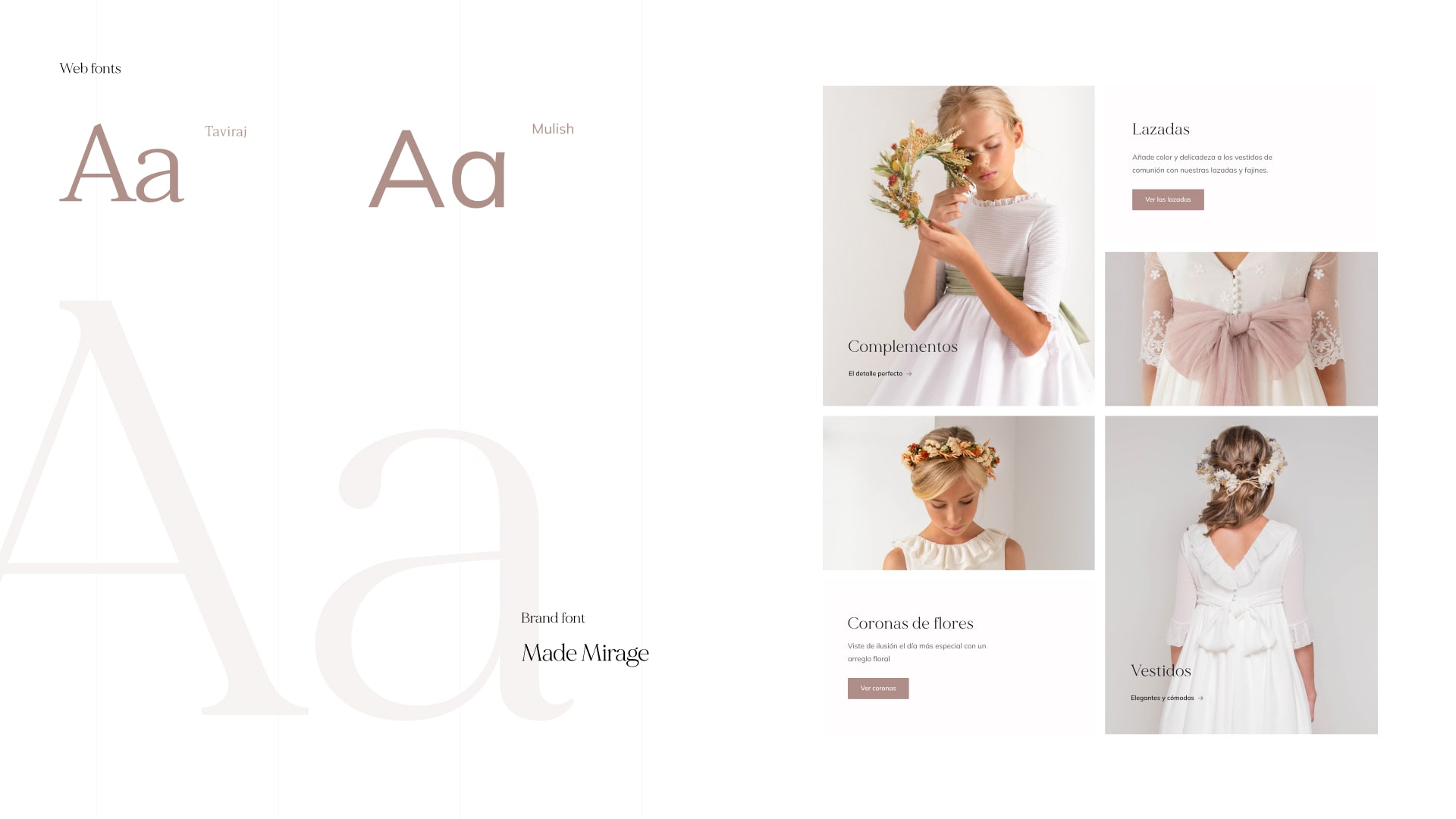
Typography plays a crucial role in defining a brand’s personality. The way letters, numbers, and symbols are combined can significantly impact perception. For DelaDosalaDoce, we selected a typography that aligned with its values:
- MADE Mirage, a modern and elegant serif typeface designed for luxurious, minimalist, and modern branding.
- Mulish, chosen for body text, complements the primary font while maintaining readability and balance.
This typeface stands out from other sans-serif fonts due to its classic proportions, especially in uppercase letters, giving them harmonious and elegant shapes. Additionally, the semi-rounded details of the letters add warmth, while the strong structure conveys stability and professionalism.
Corporate Website Design
Once we established the corporate identity and completed the rebranding, we began working on the digital product. In the initial website analysis for DelaDosalaDoce, we identified four high-priority pain points that needed to be addressed in the new design. These were incorporated into the wireframes and included the following:
Improving Navigation & Menu Categories
One of the pain points we addressed and defined in the design of the new website was improving navigation and menu categories, which contributed to optimizing the user experience, increasing user retention, enhancing usability, facilitating content organization, and boosting SEO performance.
A clear navigation system and well-defined categories allow users to find what they are looking for more easily on a website, making it more likely that they will stay longer, thereby increasing the retention rate. Additionally, an organized navigation structure helps position content logically and coherently, also improving SEO.
Building the New Information Architecture
In simple terms, information architecture refers to how a website’s content is organized to make it easy to understand and navigate. In this case, we built a new information architecture that enhanced navigation and improved the user experience, as well as usability, maintenance, and updates.
Thanks to this change, users experience little to no frustration, as they can quickly find the information they need and access content effortlessly. Having a well-structured website also makes it easier to maintain and evolve, allowing for quick adaptation to the changing needs of users.
Product Page Optimization
Regarding the product page, our goal was to optimize it to enhance search engine visibility, attract users, improve the customer experience, highlight key product features, and increase conversion rates.
When optimizing a product page, we ensure that it provides necessary, detailed, and accurate information to help users make informed purchasing decisions. Additionally, we highlight key features and benefits, emphasizing important details and advantages that users should consider. This optimization process can influence purchasing decisions and ultimately lead to higher conversion rates and increased sales.
Writing New Copy for the Website
The final, but equally important, aspect was crafting the copy for the new website. A well-written copy clearly communicates key messages about the product, its features, benefits, and other relevant information, while also building user trust and conveying credibility.
A strong copywriting strategy can influence user decisions, encouraging them to take specific actions that benefit the brand—such as engaging with calls to action that drive interaction. For DelaDosalaDoce, we focused on writing copy that aligned with the new brand identity, ensuring a consistent tone and style that resonated with the brand’s personality and strengthened the emotional connection with users.
As UX specialists, we took this to the next level with UX copywriting, which not only enhances communication but also creates a smoother and more engaging user experience. Every word we crafted plays a role in how users interact with the digital product, guiding them through the interaction flow and shaping a cohesive, immersive experience.

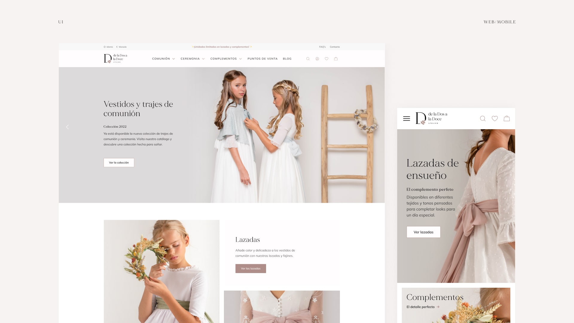
UI Design: The Final Touch
For the user interface (UI) design, we made the most of the professional studio photography available to clearly highlight the most important element—the product itself, including clothing and accessories.
We designed a digital product that is intuitive and easy to navigate, focusing on user needs and preferences, based on prior research. The new color palette, typography, and logo were seamlessly integrated into a clean and visually appealing design that grabs attention while ensuring a frustration-free user experience.
SEO & Content
Lastly, we conducted a basic SEO audit to identify existing issues and optimize content, focusing on link-building opportunities and relevant keywords.
SEO Audit
For DelaDosalaDoce, our SEO audit covered several key areas, which also helped refine and optimize the content during the copywriting process:
- Keyword analysis identifying relevant terms for the website
- Evaluation of URLs and internal linking, along with a review of information architecture and navigation.
- Content optimization incorporating keywords and recommending the creation of new and improved content.
- HTML tagging verification, indexation assessment, and site crawlability analysis to ensure search engines properly read the website.
- Identification of broken links, analysis of link diversity, and evaluation of link quality and quantity.
- Competitor analysis, comparing SEO strategies, rankings, and identifying opportunities for improvement.
- Leveraging existing high-ranking keywords, such as DelaDosalaDoce’s strong position for the product “lazada”.
If you want to see the final results of this incredible project, check it out on our Behance!


