With the continuous growth of mobile devices, web design has radically changed. It’s no longer enough to have a website that works well on a desktop; now it’s essential for your website to look and function flawlessly on any device—whether it’s a mobile phone, tablet, or desktop screen. This is where adaptive design or responsive design comes into play, allowing a page to automatically adjust to the user’s screen size and deliver an optimal experience regardless of the device used.
Índice de contenidos
ToggleWhat is Adaptive Design?
Adaptive design or responsive design is a digital design approach where content, images, and navigation elements reorganize and adjust based on the screen size of the device being used.
The key concept is that a digital page’s layout must be fluid and flexible, adapting to different resolutions without compromising user experience.
Why is Adaptive Design Important?
Adaptive design isn’t just about aesthetics; it has a significant impact on both usability and website performance.
Users expect websites to be easy to navigate, no matter which device they use. Adaptive design ensures that pages adjust automatically, preventing visitors from needing to zoom in or scroll horizontally to read content. An intuitive, smooth navigation increases the time users spend on your site and reduces bounce rates.
Moreover, Google prioritizes mobile-optimized websites in its search rankings. This means that adaptive design not only improves the user experience but also increases your site’s visibility in search results. Since 2015, Google has considered mobile optimization a key ranking factor, making it essential for any business website.
Today, over 50% of global web traffic comes from mobile devices, so adaptive design allows you to reach a broader audience. Plus, users are more likely to complete valuable actions—like making a purchase or signing up—if they can easily browse from any device.
Key Elements of Good Adaptive Design
To ensure your website is truly adaptable and functional across all devices, it’s important to follow a few best practices:
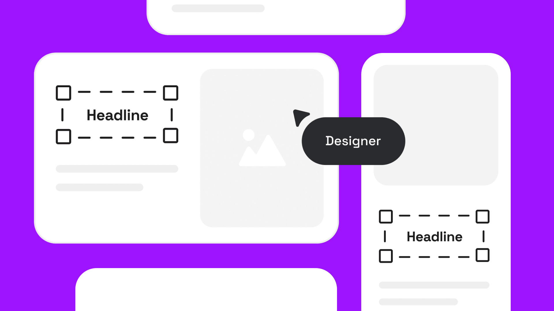
- Use of media queries: Media queries are a CSS feature that allows you to adjust design based on screen width. They define how a page’s layout should behave on small, medium, or large screens.
- Flexible images and content: It’s not just about making text look good—image and video sizing must adapt too. Use responsive images that resize automatically to avoid slow loading times and ensure proper fitting.
- Fluid grid: Instead of using fixed sizes for page elements, use a fluid grid that adjusts proportionally. This ensures a balanced and functional design on any screen size.
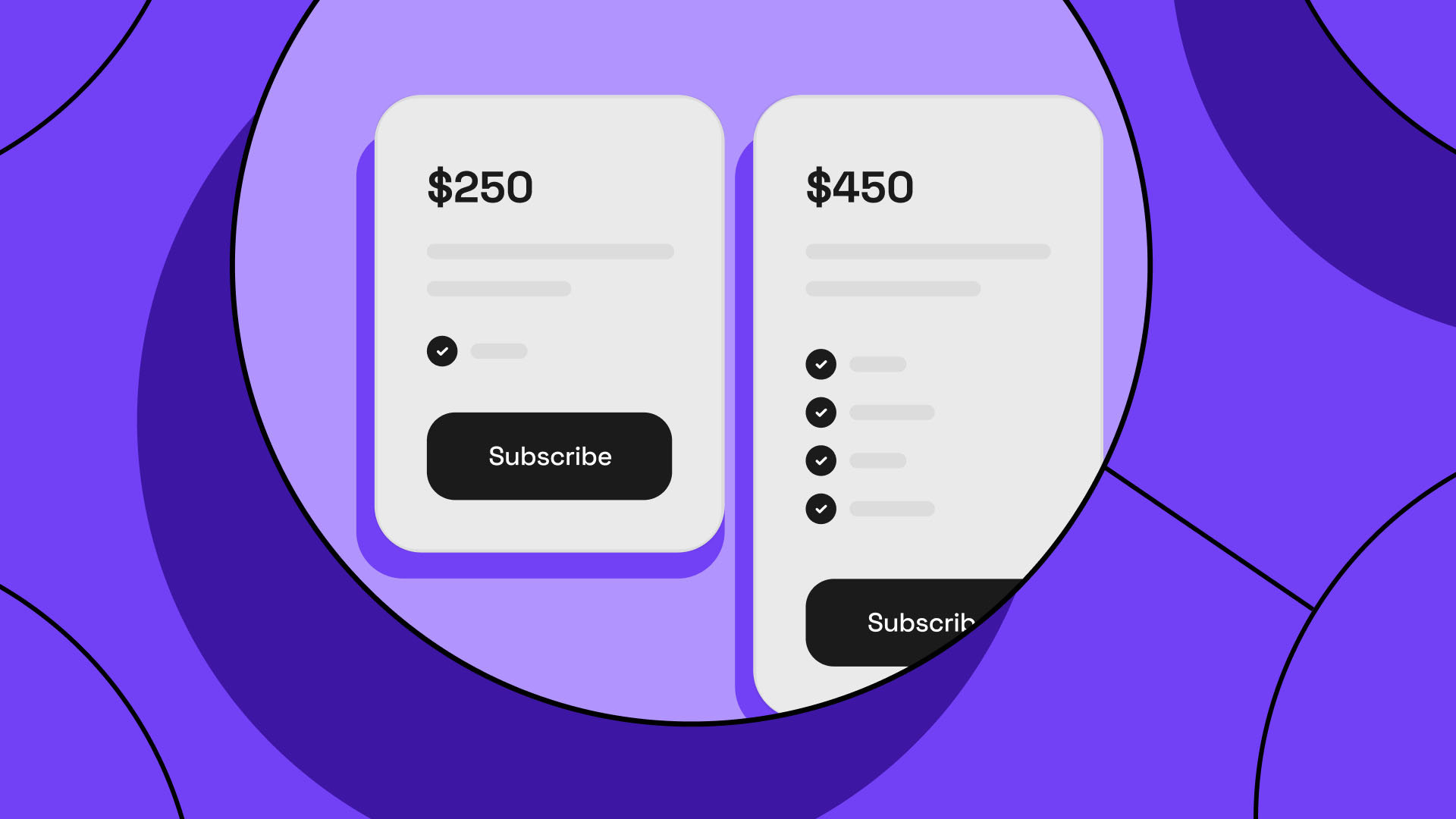
- Accessible buttons and navigation: Especially on mobile, buttons and links must be large and easy to tap. Navigation should be clear and accessible, helping users find what they need without frustration.
- Testing on multiple devices: An adaptive design must be tested on a variety of devices to ensure it performs as expected.
Benefits for Your Business
Adopting an adaptive design brings major benefits to your business. When users have a good experience on your website, they’re less likely to leave quickly. A well-adapted design reduces navigation friction, improving engagement metrics.
Instead of maintaining separate versions for mobile and desktop, adaptive design centralizes updates and maintenance in a single site version. It also makes it easier for users to complete key actions, such as signing up or making a purchase, increasing your conversion rates.
Adaptive design isn’t just a trend; it’s a necessity for any website that wants to remain competitive in the digital age. Ensuring your site works efficiently across all devices not only enhances user experience, but also positively impacts your SEO—and ultimately, your business results. Adapting your site is an investment that pays off if you want to stay aligned with modern user expectations and maximize your site’s performance.

 Loading...